Hello there, I'm a user experience designer in Washington, D.C. currently working for the
Federal Election Commission.
I love making (and improving) experiences in the public sector. These are largely underfunded but big and important experiences. They're big because of their impact. They're important because making experiences that are equitable and accessible to all, if I may say very cheesily, help make the world a better place. I have a deep focus on user research and experience design.
As a team of one at the FEC, I'm responsible for it all and I handle projects from start to finish. That finish looks different to many, but as we all know - there is no real finish line. What can we learn next? Who have we left out?
My Work
Administrative fine calculator - FEC.gov
The administrative fine calculator assists the FEC regulated community to determine how much a potential fine might be for a late or non-filed report.
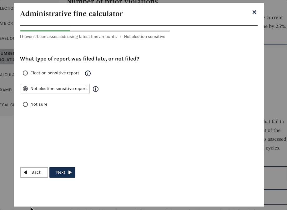
Beyond the updated styling, the updated calculator provides helpful guidance along the way and lets the users know their progress.
During usability testing, I observed confusion with the language used throughout the calculator. To ease this, informational pop-outs were included and provide relevant definitions on each screen.
Users were also concerned about what happens once the calculator was completed. So additional summary information on the final screen was added to clearly explain next steps and manage user expectations.
This project would not have come to fruition without usability testing with users, stakeholder interviews, and working closely with a front-end developer.
Raising summary - FEC.gov
Providing high-level totals of money raised is one of the main entryways into the more than 5 TB of data on FEC.gov.

With 5 TB of data available, it's important that we create visualizations that call our specific pieces to help to tell stories about how money is raised in connection with federal elections.
Presenting the data this way can give citizens, researchers or interested groups insights into top-level numbers on how much money was raised across different federal elections and across time.
Users can filter by office and their election year. Also available is a spending visualization that mirrors this version on raising.
User and stakeholder research and synthesis
Any successful modern product requires research and regular testing. Beyond this, the synthesis of that research is critical to understanding your users and making a product or feature that is effective, useful, and usable - particularly when it comes to the use of federally appropriated funds.

This is an example of a card sorting exercise to better understand how familiar our users are with the very technical language we use. In this card sorting exercise, I learned that some of our terminology tends to be used interchangeably and caused us to question when and why we use certain words.

This is an example of usability testing synthesis. Taking the responses received during usability testing and grouping them into categories, I was able to identify some critical takeaways and next steps to improving the usefulness of our receipts data table search. Particularly we were able to identify pain points with how our sorting functioned at the time.

This artifact from a design studio I conducted with team members - individuals who receive inquiries from the public for FEC data and those intimately familiar with that data - helped to guide initial designs for future data visualizations. This helped form the basis for new and valuable entry points into significant portions of all available data.